Since I got my full-time gig with the company I work for, they've dumped the company website in my lap. Right now they just want to keep the thing current and up-to-date. However, the long term plans call for a newly designed website that better advertises the company's image. I've been working on this for a few days and wanted some outside opinion. All I have done for the moment is a possible homepage. I'm waiting for higher approval before making anything else. I like what I've done so far, but it seems like there could be a little more to it, not sure what though.
Just some background info on the company I work for... We are a pallet company based out of Ohio that has plants located across the midwest and east coast. We build new and recycled pallets, sell and repair packaging machinery for stretch wrap, and handle third party logistics. I'd appreciate some thoughtful opinions. Thanks.
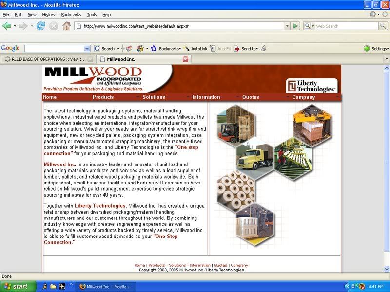
Click here to check it out.
Website Opinions
Moderator:Lexx Yovel
-
Kurke Aumea
- First Lieutenant
- Posts:374
- Joined:Sun Dec 16, 2007 11:11 pm
3134 Posts + Whatever I have now


Looks great so far. One suggestion I have is to add red borders to the side so it doesn't just transition from white to gray, it might add a more lively feel to it. Also, you can replace some of the slashes with "and"s to make it feel more personal. I really like the picture hexagons on the side, you did a great job with the effects and such.

-
Kurke Aumea
- First Lieutenant
- Posts:374
- Joined:Sun Dec 16, 2007 11:11 pm
telemchus wrote:Looks great so far. One suggestion I have is to add red borders to the side so it doesn't just transition from white to gray, it might add a more lively feel to it. Also, you can replace some of the slashes with "and"s to make it feel more personal. I really like the picture hexagons on the side, you did a great job with the effects and such.
Yeah, I've been wondering about the side borders... I just changed it to a white-gray transition this afternoon. Originally it was all white, which made the corporate logo look a little funny... The text does need rewritten. I just did a copy/paste off our current website. I figure someone higher up in the corporate ladder can make that decision. I'm glad you like the graphic, I spent more time than I should have on it today.
I do feel like the whole page is a little top-heavy. It's like the bottom need some sort of visual weight to it... I just don't know what to add to it without making it look tacky.
3134 Posts + Whatever I have now
-
Kurke Aumea
- First Lieutenant
- Posts:374
- Joined:Sun Dec 16, 2007 11:11 pm
Yeah, a simple red/orange border can go a long way. I still need a way to give some weight to the bottom... Ooo... I think I got it. See the red background image behind the company logo at the top? What if I stick that at the bottom where the current footer is and change all the footer text to white? Hmmm... That might work pretty good.... I can get rid of that horizontal line that's been driving my vertical spacing crazy for some strange ass reason. Add some borders to the sides and I think it would look pretty good.
3134 Posts + Whatever I have now
-
Kurke Aumea
- First Lieutenant
- Posts:374
- Joined:Sun Dec 16, 2007 11:11 pm
telemchus wrote:Double posts are fun.
For the bottom, you could color the box the same shade of red the top is with an arc going over the information. Probably want to add a shader to that, too, to keep up consistency.
Hmmm.... I like your line of thinking. I'm also wondering if the links at the bottom of the page are even neccessary. I think I put them there just to add more color to the bottom of the page more than anything... I could do the red background and then stick the footer information into a white circle/arc like I did with the corporate logo.
3134 Posts + Whatever I have now
-
Kurke Aumea
- First Lieutenant
- Posts:374
- Joined:Sun Dec 16, 2007 11:11 pm
telemchus wrote:That would probably be the best course to take, but make sure it's not too much like the company logo, too much symmetry isn't necessarily a good thing. I like you're pattern idea though, definitely incorporate that.
Yeah, the whole footer wouldn't have to be too big. I agree that it shouldn't be bigger than the company logo. I could do an image map where the text would be and link it to that e-mail address. The whole footer probably wouldn't be more than 50 pixels high with like a little white arc/bubble/circle for the text to go inside of. The only bad thing about all this is that the images all need to be optimized better. The file sizes for the header and the hexagon image are large than I want them to be, but for now the work quite well.
Great... Do I go and watch Trasformers or work on website..... I hate these kinds of decisions. lol
3134 Posts + Whatever I have now
-
Kurke Aumea
- First Lieutenant
- Posts:374
- Joined:Sun Dec 16, 2007 11:11 pm
I did some updates to my test site today. On the homepage I added the red footer to add some balance, but decided to not add red borders. I dumped the body content into an iFrame (think of a window within a window) where all of the content will show up. The only downside is that the size is static, so the size you see is what you're stuck with... I might revert back to traditional frames in that case...
I added a subpage to give some use to the menu bar. If you go to Solutions > Pallet Services, you'll see the only working subpage. It look spretty good, but the images are kicking my ass... But they look f***ing cool! lol
Please share your constructive criticism with me. Thanks!
I added a subpage to give some use to the menu bar. If you go to Solutions > Pallet Services, you'll see the only working subpage. It look spretty good, but the images are kicking my ass... But they look f***ing cool! lol
Please share your constructive criticism with me. Thanks!
3134 Posts + Whatever I have now

-
Kurke Aumea
- First Lieutenant
- Posts:374
- Joined:Sun Dec 16, 2007 11:11 pm
-
Kurke Aumea
- First Lieutenant
- Posts:374
- Joined:Sun Dec 16, 2007 11:11 pm
I'm kinda of going with a hexagon theme. So across all of the pages would be different pictures (shaped as a hexagon of course) and different arrangements of hexagons. Believe it or not, there is a method to my hexagonal madness. lol
After trying to decide what ideas/services/products that I though needed pushed on the company website, I stumbled upon some PDF documents detailing six important services we offer. So, after reading over them, I determined that they were the primary things that should be pushed. So, there are six services and a hexagon has six sides... it's a perfect fit! That and I got lucky by coming up with the idea while playing around in Photoshop...
Of course, now I've been tasked to come up with a website for an archery company we own... Their current one is bland, dry, and full of "Your news content goes here" and "Lorem ipsum...". Yeah, looks like Millwood takes a backseat for the moment. Now I jsut have the nightmare of trying to figure out what to put for the archery website. I don't even have the company logo for it!
3134 Posts + Whatever I have now